Vision Branding
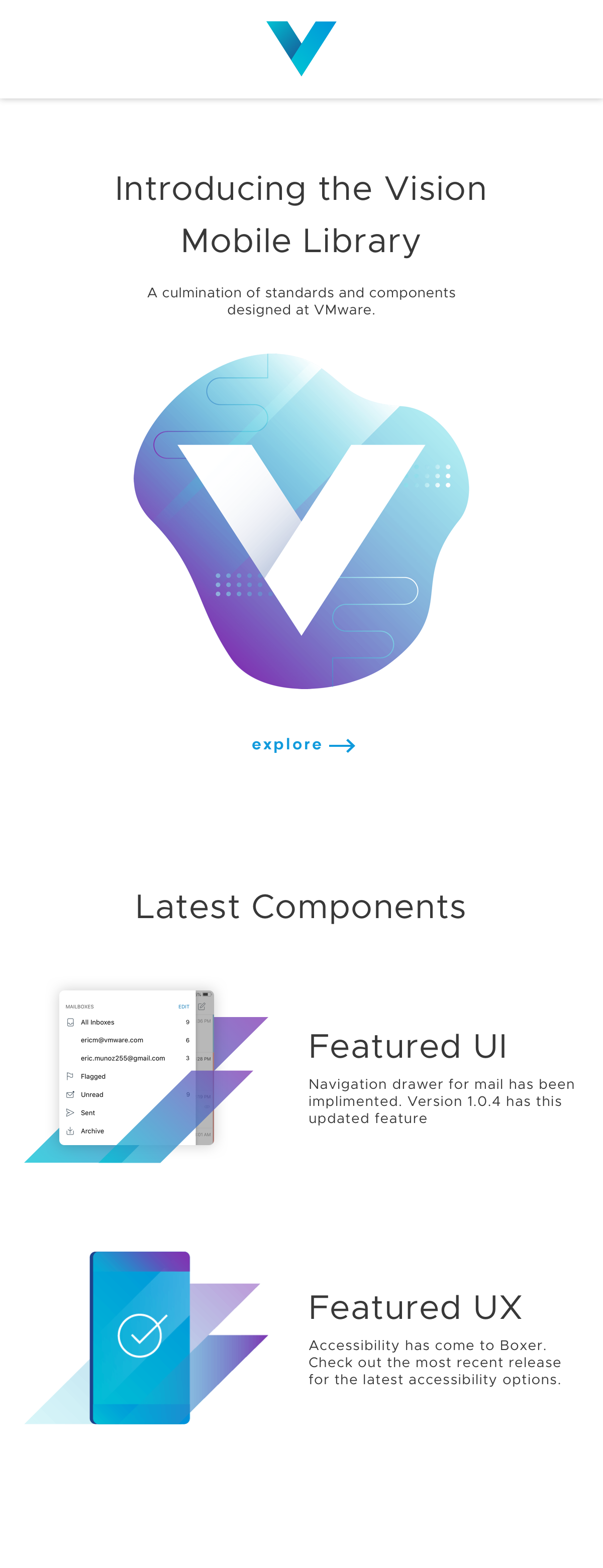
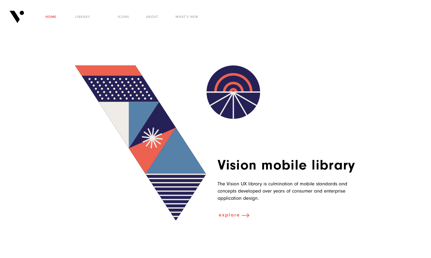
The Vision Component Library is a mobile library geared towards easing the friction between design and development. The library is a culmination of reusable components that span our mobile products. By standardizing these components across platforms, we are able to quickly and efficiently deliver UI components that are familiar to both our design team and our developers. The library was in need of branding elements that adhere to VMware's larger brand guidelines but also lets the library stand out as a consumer-facing tool.
Platform Support
Web, Print, iOS, Android 2018 - Present
Brand Exploration
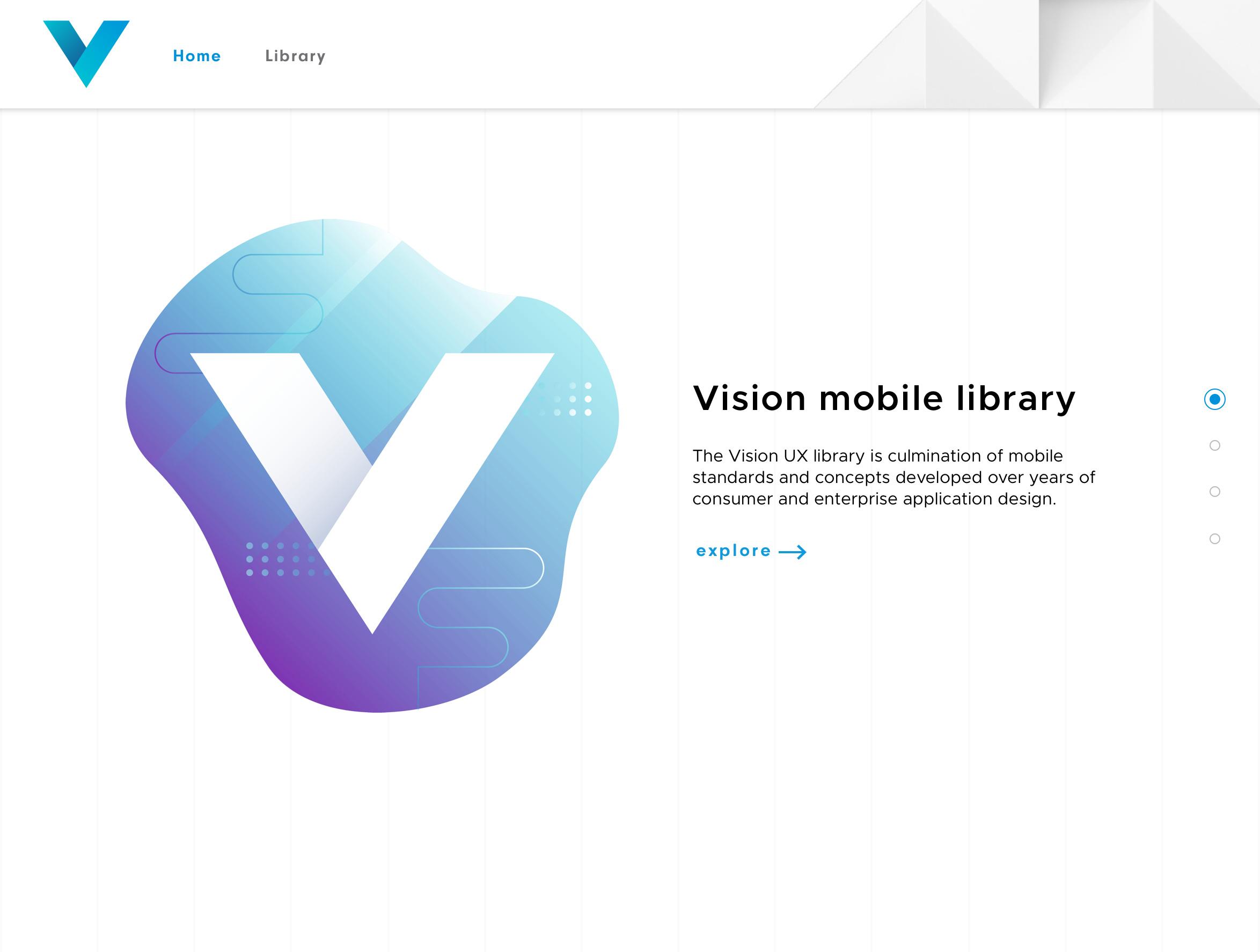
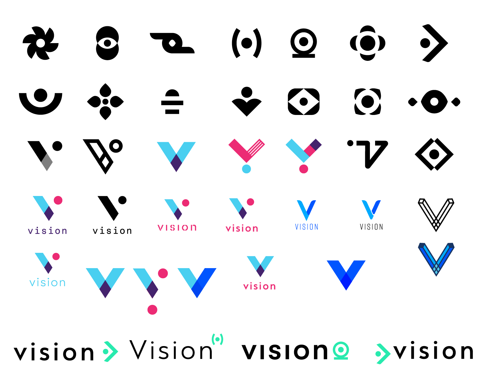
The process started by developing a strong foundation that could exist on its own as well as inside of the VMware brand. Exploring multiple options including wordmarks and abstract symbols, utilizing the "V" for Vision as well as a nod to the larger VMware seemed to be appropriate.
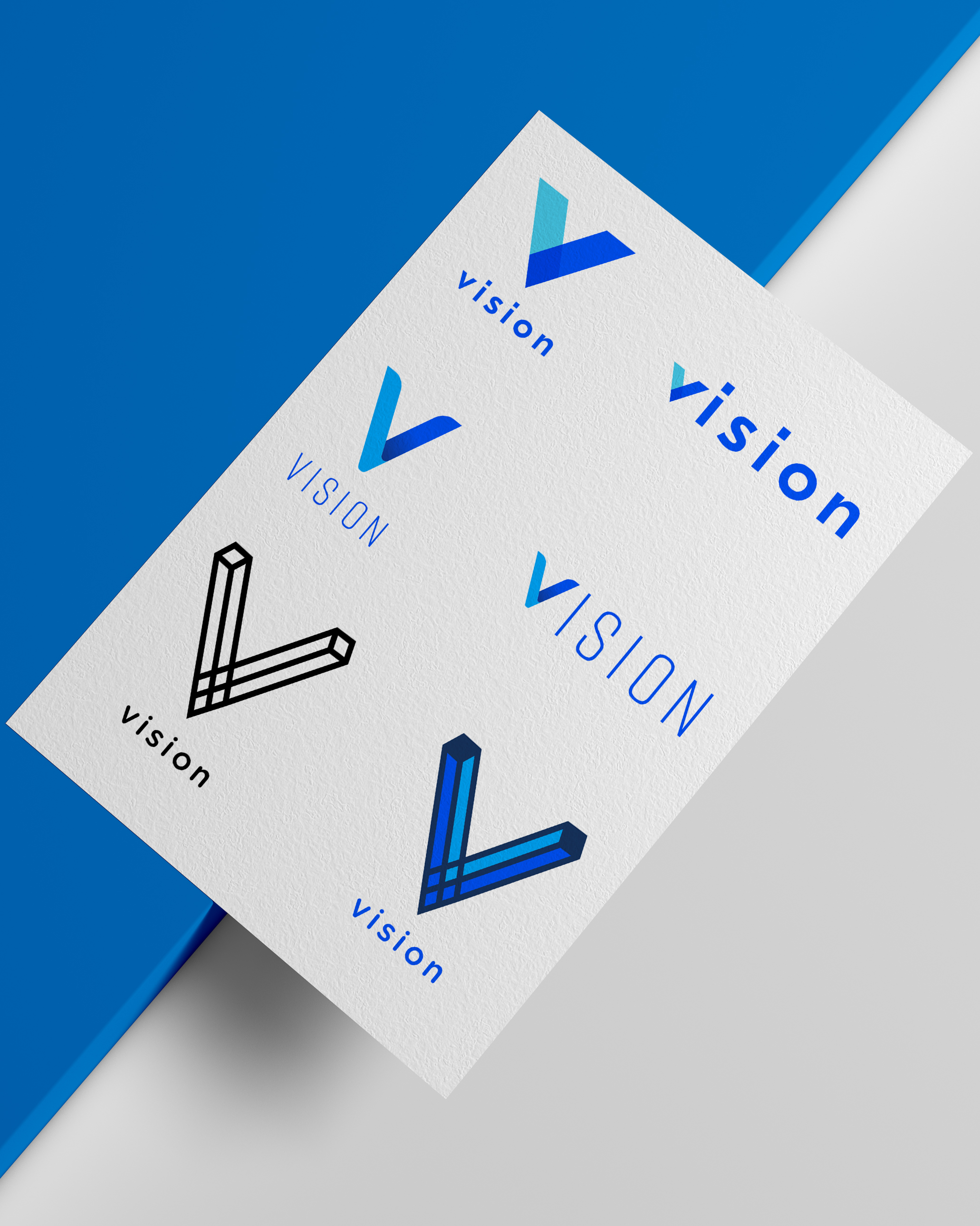
Runner Up
This direction was worth exploring, but in the end didn't make the cut. There are a couple of other brands using the same treatment when it comes to the "V". The treatment seemed unique, but in the end I felt it did not fit within the larger VMware band.
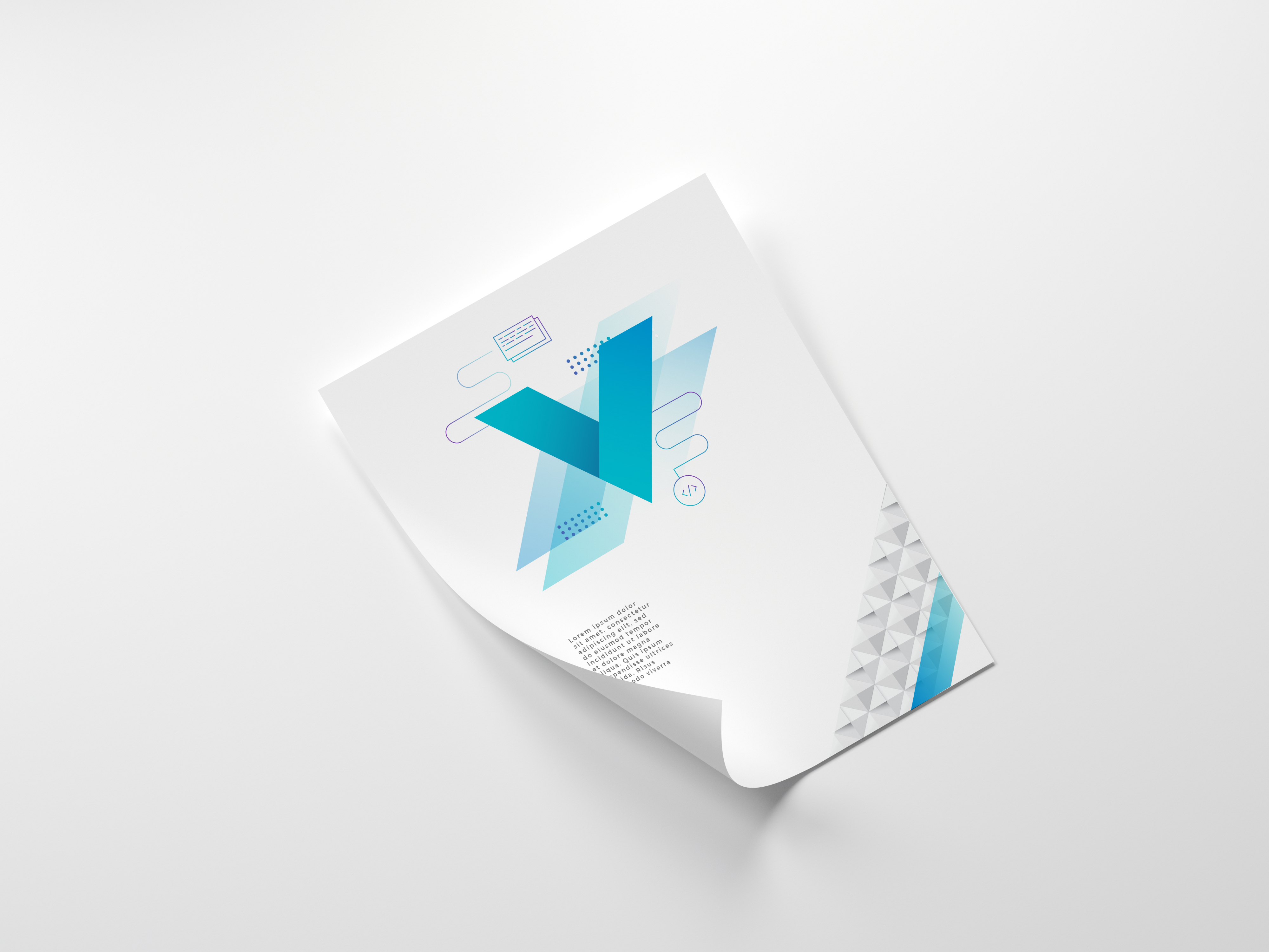
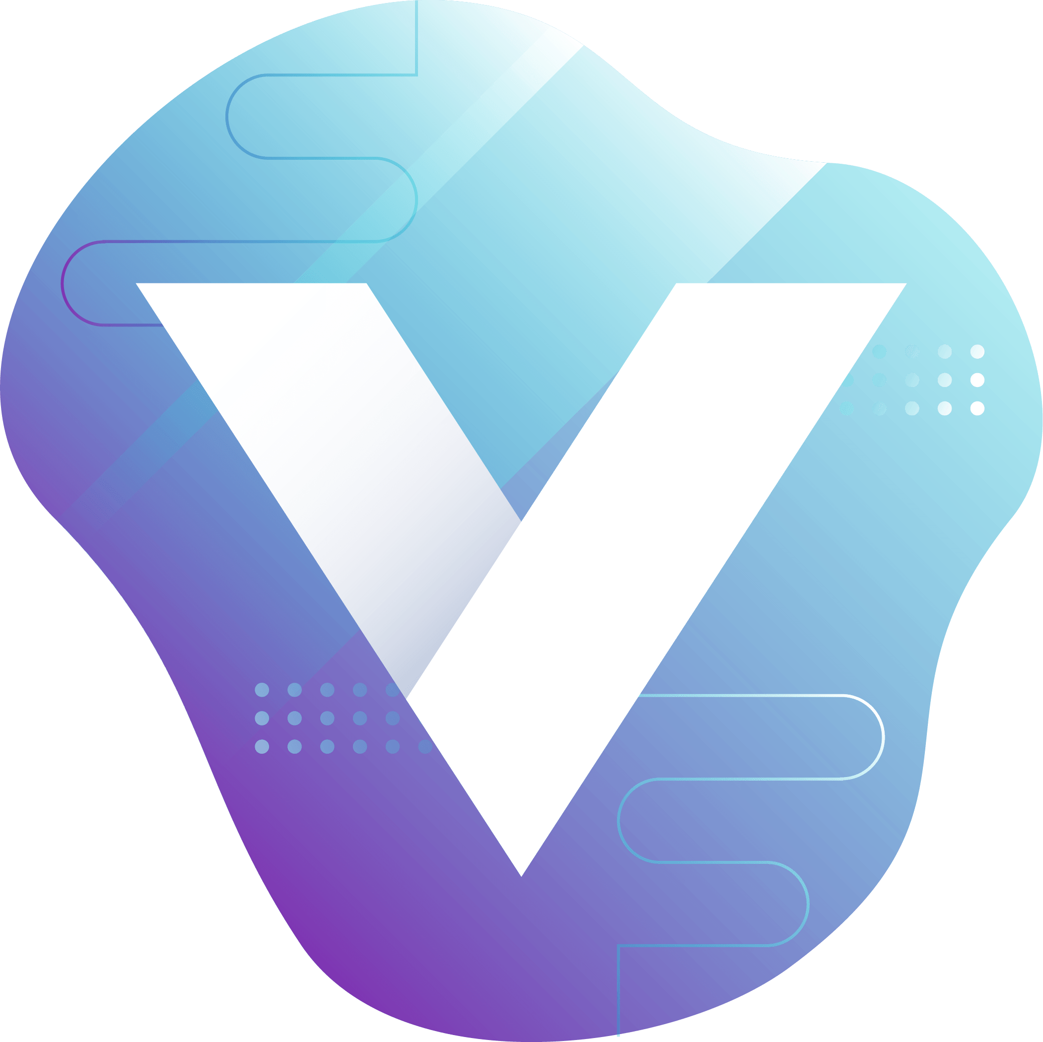
Final Direction
The final direction stemmed from the texture that the VMware brand guidelines incorporate. The texture is a white, square pattern with subtle shadows. Wanting to keep that subtlety, I decided to take the brightest colors in the palette and utilize them against the white from the texture to create an interesting juxtaposition of color and shadow.