Designing Productivity
Boxer is the way our team provides a secure way for enterprise companies to utilize email. Our users rely on Boxer because it offers the benefits of a secure, admin-controlled email application so they can use their own device to access secure documents as well as to conduct day to day business for their corporation. Our team strives to provide the benefits of a managed device without sacrificing the beauty and experience that consumer applications offer. This case study outlines the research and updates that were made to refresh the way our user's see their email.
Platform Support
iOS March 2019 - Present
Exploration
The goal is to refresh and modernize our current UI without losing accessibility features, localization features that are already implemented. We want to bring our UI closer to consumer application already in the market.
Obstacles
• Localization: Cater to 20+ languages
• Accessibility: Support system accessibility standards.
• Interactions: Update the way users interact with the listview and email cells themselves.
• Legibility: The user must be able to quickly digest and take action on emails efficiently no matter the device.
Strategy
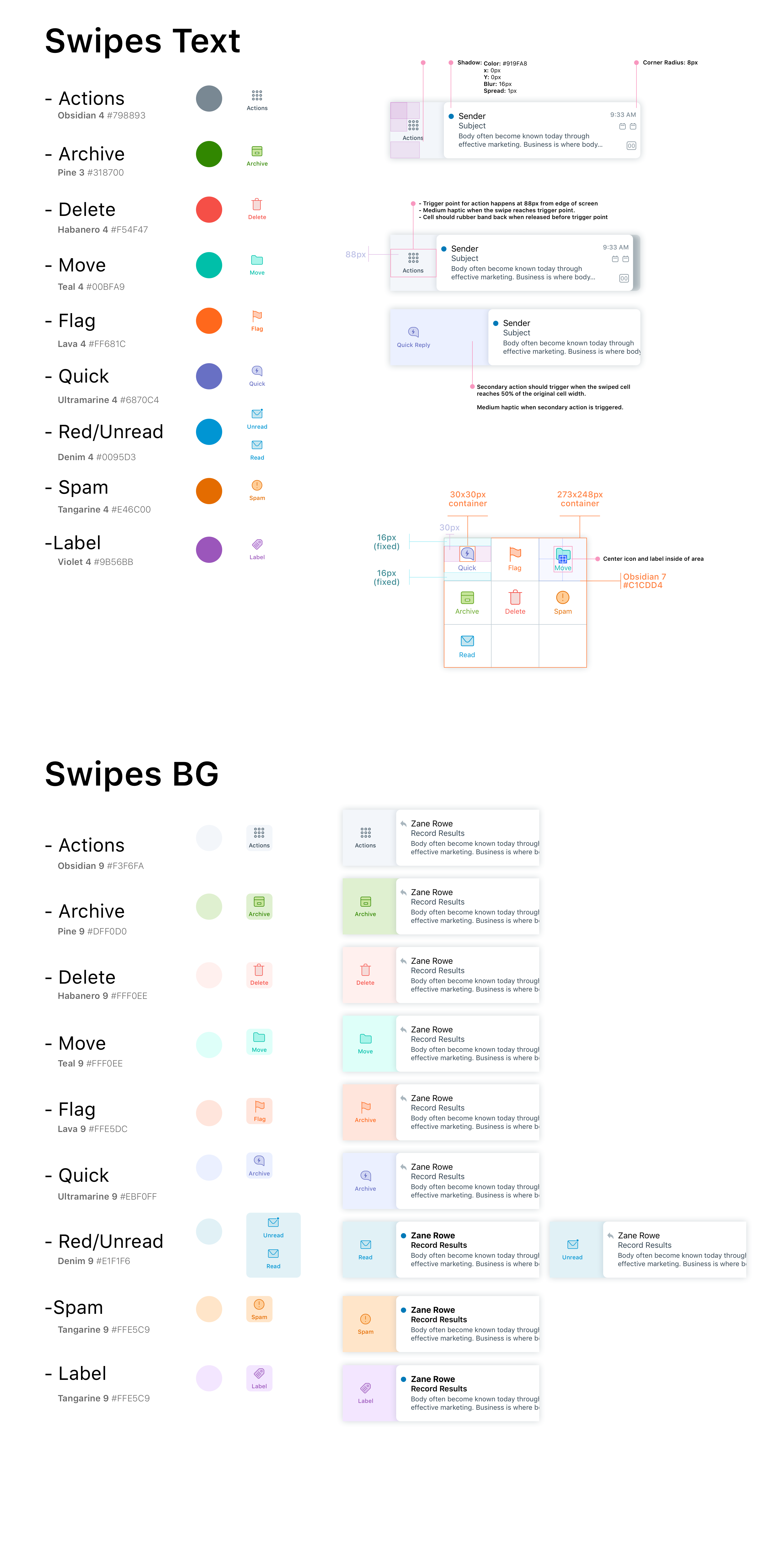
• With dev time in mind, offer a clean, focused solution that will account for all obstacles. We must update our base UI, our swipe actions, and our multi-select features in order to create a cohesive experience on the mail listview.
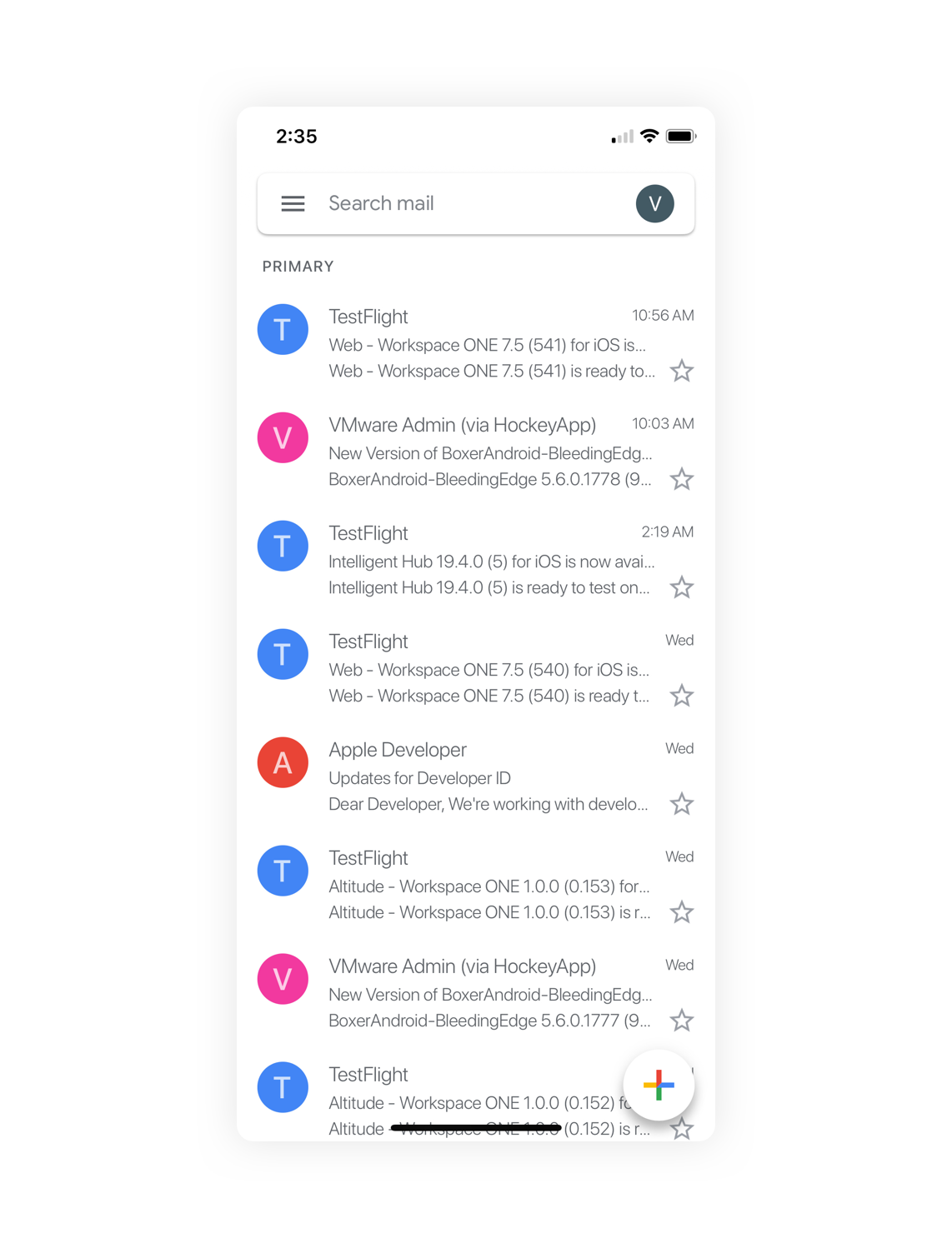
Competitive Analysis
Gathering screenshots from consumer apps across the iOS platform, I was able to, along with the help of some users, some colleagues, and some strangers, compare and contrast our UI to four other email applications that exist today. Below are some of those application UI's.
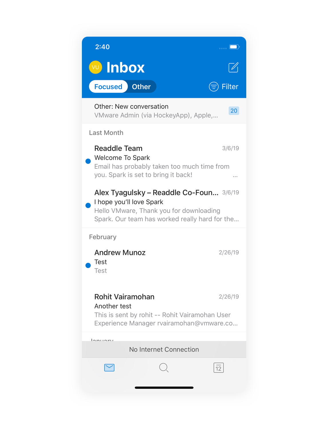
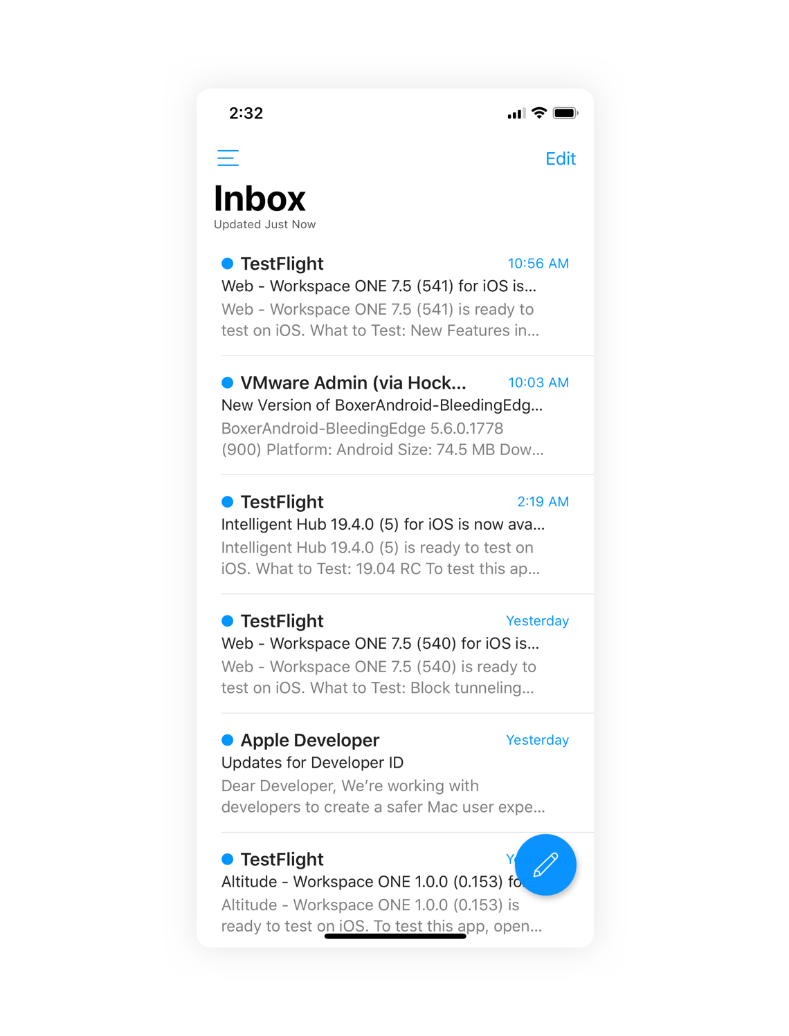
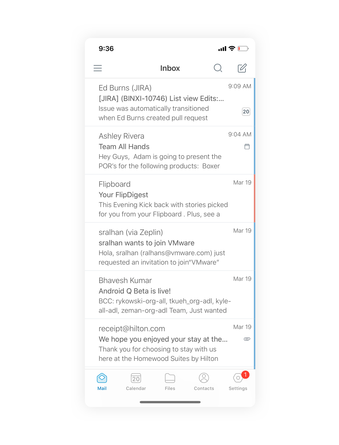
Boxer's Current UI
This is the existing Boxer user interface. As you can see, there is a lack of hierarchy, legibility, and structure. We offer a feature that let's the user toggle on or off avatar's, below you will see both.
Takeaway's
Based on feedback from user reviews and user testing, here are the key points I chose to focus on in order to get the most value out of this exercise.
Headers
• Weight and Color and Position of “Inbox”
• Potentially having color icons
• Check font use across app
Universal Cell
• Sender and Subject stand out
• More space
• Body text color lighter
• Focus on body text in correlation to
subject and sender
• Cell icons true 1px icons
• Order of whose name shows up
• Subject heavier than the sender
• Hierarchy different in read and unread
Listview
• Time blocks
Today
Yesterday
This week
Last week
This month
Last month
Month Name
Year
• Manual load more
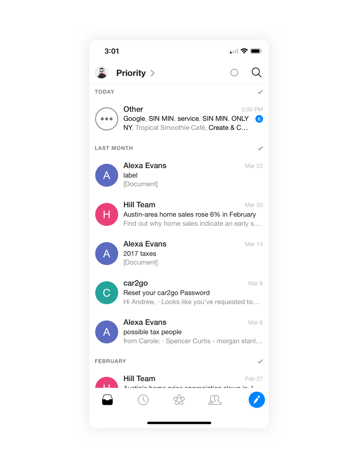
Listview OId vs New (implemented)
This is the existing Boxer user interface next to the new UI with the above changes made.
Listview Prototype
Understanding how the new design would feel in the hands of our users is something we prioritized. I put together interactive prototypes for each feature we would be adding, in order to not only test but have a base our dev team could check back on once we handed them the final designs.
Multi-Select Prototype
Swipes Prototype
New Avatar Tutorial
New Message Banner
Spec
Handing off detailed specs is imperative in helping development implement the experience you are hoping for as a designer. Along with the prototype and Invision link, I always hand off design specs and review them with the development team to ensure all are in agreement as to what will be developed. Below you will find examples of a few of those specs.