Icon System
Creating a cohesive product suite means aligning components across apps. When taking inventory of all the components that needed adjusting, the one aspect of all our apps that stood out was our icon system. There was a blatant mismatch of the icons that made up our product's UI, and I was tasked with creating a system that could span all of our products and platforms.
Platform Support
Android, iOS 2017 - Present
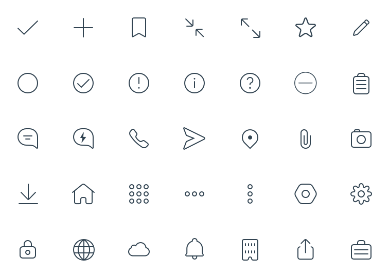
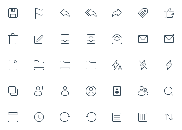
One Pixel System
The EUC icon system is designed with simplicity, accessibility, and scalability in mind. The aim was to create a system that could adapt and expand to our needs while maintaining a consistent structure. The one-pixel system is used in our iOS and Windows products.
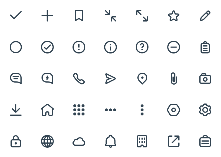
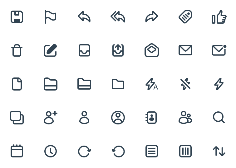
Two Pixel System
The two-pixel system is designed for use in our products on the Android platform. The icons are meant to be more in line with the material design icons that Google has set in place, while not sacrificing our brand.